Columns
Required props
| Property | Description |
|---|---|
| label | The text that displays on the heading |
| name | The property that stores the data to pass to the row, this can use dot notation for nested properties e.g. category.name |
Optional props
| Property | Description |
|---|---|
| type | Pass in the name of a column type e.g. BooleanColumn or even a custom column. |
| sortable | Enables the sorting button on the heading e.g. 'sortable' => true. |
| filters | An array of text / value to make the heading filterable - find out more in the filtering docs. |
| filterMultiple | If the filter has multiple options. |
| align | Text alignment of the content. |
| width | Take a guess. |
| className | A custom classname for the column. |
| fixed | If the column should be fixed position e.g. left or right. |
| searchable | If the column should show in the search dropdown. |
| searchColumn | What db column to search when selected. |
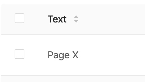
Text
By default all column types act as text unless a type is specified.

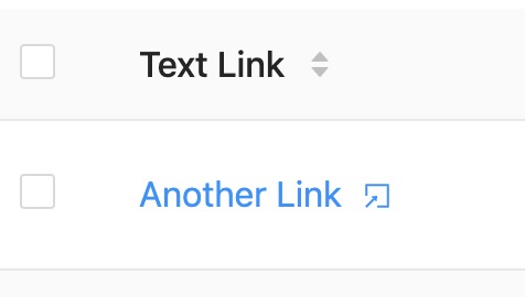
Text Link
You can turn columns into links, which can be useful for linking to related models etc.

Type: TextLinkColumn
Props
| Property | Description | Example |
|---|---|---|
| labelText | A static text label for the link | Edit Page |
| labelIndex | The property which holds the text value | category.name |
| name | Where the link should go | category.url |
| icon | If an Icon should display before the text | home |
| newTab | If should open in a new tab (defaults to true) | false |
[
    'label' => 'Category',
    'type' => 'TextLinkColumn',
    'name' => 'category.url',
    'labelIndex' => 'category.name',
    'icon' => 'groups',
    'newTab' => true,
]
Edit Link
For usability we like to make the entry name a clickable link to take you to the edit page, so we recommend using this as your first column type for the entry name field. e.g.

Type: EditLinkColumn
[
    'label' => 'Name',
    'type' => 'EditLinkColumn',
    'name' => 'post_name',
]
Video
When using the video input you can display a small thumbnail and link to it in the listings.

Type: VideoColumn
[
    'label' => 'Instructional Video',
    'type' => 'VideoColumn',
    'name' => 'video',
]
Image
When using the image input you can display a small thumbnail and link to it to the full size.

Type: ImageColumn
[
    'label' => 'Featured Image',
    'type' => 'ImageColumn',
    'name' => 'image',
]
Icon
Often you might want to display an icon to represent something, you can use the entry transformer to provide the name of the icon to display.
Type: IconColumn
[
    'label' => 'Type',
    'type' => 'IconColumn',
    'name' => 'type_icon',
]
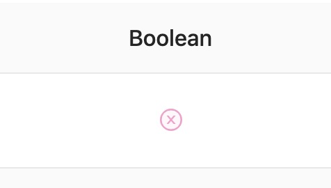
Boolean
To display either a tick or a cross based of a boolean you can use the boolean column.

Type: BooleanColumn
Media Manager
The media manager column allows you to display 1 or more thumbnails for some uploaded media, just provide the IDs of the attached media.

Type: MediaManagerColumn
| Property | Description | Example |
|---|---|---|
| max_items | Maximum assets to show | 2 |
[
    'label' => 'Photos',
    'type' => 'MediaManagerColumn',
    'name' => 'photo_urls',
    'max_items' => 3,
]
Custom Columns
Creating columns is fairly straight forward, it only really consists of a javascript file.
You'll need to:
- Create your component
- Register your component
- Use it!
Below is an example...
Create your component
import React from 'react'

export default class MyColumn extends React.Component {

    components(props) {
        super(props)

        // You can access the whole record via `props.record`
        // Explore all the props to see what data you get :)
    }

    render() {
        if (!this.props.text) {
            return <span>-</span>
        }

        // The value provided by `name` gets returned into the `props.text` field.
        return this.props.text
    }
}
Register your component
Depending on your setup, the below might change - however for example purposes we'll assume you're using Mix.
Firstly you'll need to import your component into the entry file e.g. maelstrom.js
- Edit
resources/js/maelstrom.js(or what ever your entry file is which runsrequire('@maelstrom-cms/toolkit');) - Import the component registry
- Register your component
import Registry from '@maelstrom-cms/toolkit/js/support/Registry'
import MyCustomColumn from './MyColumn.js'

Registry.register({
    MyCustomColumn: MyColumn,
});

require('@maelstrom-cms/toolkit');
Make sure you register your custom components BEFORE initialising @maelstrom-cms/toolkit.
Once you've confirmed your JS is included on the page you can render your component by including it in your $columns array.
Use it!
@extends('maelstrom::layouts.index', [
    'columns' => [
        [
            'label' => 'Page Title',
            'name' => 'page_title',
            'type' => 'MyCustomColumn', // The name you registered your column as.
        ],
    ],
])